
Project Two: Data
Foundational analysis of the data gathered by Project Two with acknowledgement of the inherent biases and limitations.


Project Two is an open-ended exploration into how people are actually using AI today. I collected views from people in my network between April and June 2025. Via a simple survey form, a variety of messages in text or audio format and a small number of direct interviews.
This post summarises the data sources used for all of the analysis and commentary generated through Project Two. I have tried to give an honest view of the biases and limitations that are inherent in the data.
Anything that seems misleading or not representative of the data in the commentary and publications flowing from Project Two is entirely my fault. Either through my own biases or my giving misleading prompts to those pieces generated by AI.
Here is a link to a slide deck that includes all the charts and points in a more presentational form.
Basics and Bias
I have received a total of 157 submissions from 148 people. Roughly a 4% response rate from about 3,700 requests.
Everything in this survey is biased by the demographics of people I can reach through my network. Geography, age, gender, professional background and roles all reflect this.
That brings inherent bias from the 40 years of my career and the working context that surrounded me over that time. No doubt it reflects some personal bias as well. At this stage of my life it is impossible to separate these strands.
19 of respondents were anonymous and I chose not to collect any demographic information as part of the survey. So none of these numbers add up to 100%. And the allocation across bands may be slightly wrong.
For reference you can find the survey form here: Project Two survey. You can even still complete it if you like - I will add your input to the data sources.
Demographics and other numbers
That said, I am delighted with the response. The spread in the 4 tables that follow shows:
Responses from 21 countries - albeit two thirds are UK based

Roughly one third are over 50 - not skewed as old as I expected
Two thirds male and around 22% female - the reality of progress on gender equality in the last four decades.

One third have a professional background and nearly the same come from tech or engineering - pretty reflective of my career path.
One third are in tech or telecoms and another 20% still work in professional services - quite a similar pattern.
30% are independents of some kind. This is probably more reflective of the demographics than age. A large chunk of my peers are like me. Post the full time career but still striving to add value where they can.

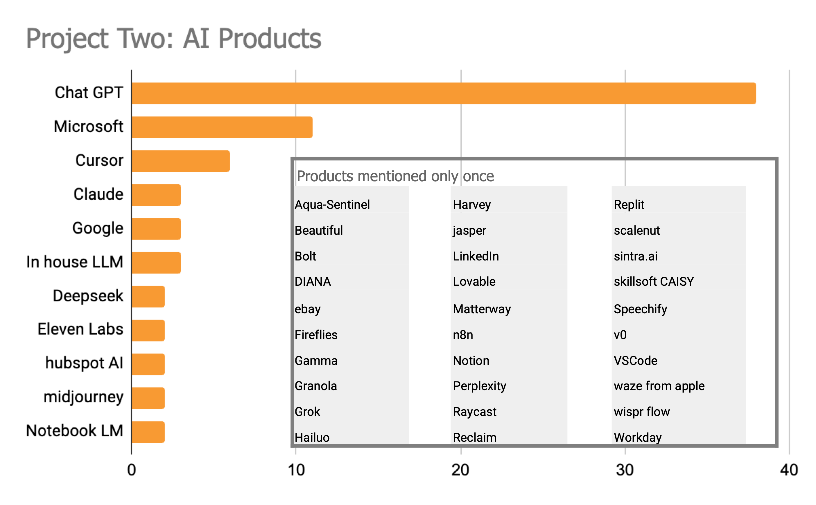
One other "demographic" counts the number of times specific products were mentioned. I did not ask people to tell me which products were used so these mentions are in some sense spontaneous. Nonetheless the pattern is consistent with the current consensus on winners and losers with ChatGPT being the most common choice.
Trust and risk
There is one final element of analysis which in turn reflects some bias in the sample and the questions. I deliberately chose not to ask questions about AI risk or related topics such as ethics.
When analysing the data, I included a column for those who chose to mention risk related topics. Two thirds made no mention of any risk. Less than 10% who took the view that AI is too risky and/ or should be tightly restricted.
The rest were spread across a number of specific issues which are drawn out in the table.
My bias is strongly towards AI as an opportunity and a positive. So I suspect both the questions and the people I reached out to reflect this. Given the questions and the subject, those who responded are perhaps even more likely to represent the optimistic side of this debate.
Interesting nonetheless….

Word clouds
The questions themselves were open ended and general. So they do not make for natural numeric analysis. I have not tried to impute a statistical pattern.
Instead, I have put together three word clouds:
Use cases mentioned
Use cases which respondents say they do not choose AI
Use case which respondents have observed in others
There is inevitably some overlap across these images.
Word cloud 1 - How are you using AI? What works well and why?….

Word cloud 2 - What AI capabilities are you not using and why?….

Word cloud 3 - How do you observe others using AI?….

Conclusion
These tables represent the data biases and all. I should perhaps add that I did the analysis myself so probably some minor errors in accuracy as well.
Everything produced from Project Two is based on a combination of this dataset, the summaries produced by AI (principally Notebook LM) and my own thoughts.
This document should be seen as a foundational reference for all other outputs.
Thanks for reading